Services
As trusted advisors, we collaborate closely with our clients to design and deliver tailored software solutions, ensuring industry-leading innovation, sustainable growth and a positive impact on your business and the communities we serve.
A DEVELOPMENT PARTNER COMMITTED TO YOUR SUCCESS
Custom development services from a team of professionals committed to solutions, not just software
With more than 20 years of experience and a team of more than forty DevOps, Quality Assurance, and Project Management professionals, Envoc is ready to guide you on the path from idea to innovation.
Custom software development
Turn a raw idea into an industry-changing innovation.
Bring your idea to life with our proven software planning and development process, focusing on a three-stage effort involving strategy, collaboration and ongoing support.
OUR PROCESS
PROJECT DISCOVERY AND PRODUCT STRATEGY
We begin by helping you define your business objectives, connecting the specific outcomes you want to achieve to the tools and capabilities available. We clearly map the project milestones and time estimates, ensuring we meet and exceed project expectations.
COLLABORATION AND COORDINATION
Our collaborative software development approach combines dedicated project managers, skilled developers, and ongoing communication to ensure project requirements are successfully achieved. By prioritizing optimized workflows and enhancing user experience, we deliver exceptional results that meet our clients' needs.
ONGOING DEVELOPMENT AND PROACTIVE SUPPORT
Our commitment to clients continues post-project with comprehensive maintenance, regular updates, security enhancements, and performance optimizations. We adapt to evolving needs, provide dedicated support, and ensure the software remains aligned with clients' objectives for long-term satisfaction.
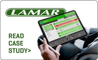
"The Envoc team brings the right business acumen to be a trusted business partner."
Brent Neel - VP, Business Systems
Lamar Advertising
Faster Project Delivery
Accelerate project completion by augmenting your team with skilled resources.
Skill Expansion
Enhance your team's capabilities with diverse expertise and industry best practices.
Cohesive Collaboration
Foster seamless collaboration for improved project outcomes.

Dev Team
Augmentation
At Envoc, our Development Team Augmentation services provide an infusion of talent and expertise to enhance your software development projects. We collaborate seamlessly with your in-house team, filling skill gaps and boosting productivity to ensure your projects are delivered with precision and efficiency. Trust Envoc to be the sage partner that empowers your team and elevates your software development capabilities.
Staff augmentation can level up internal team productivity.
Read The Envoc Blog

Mobile App
Development

native ios

native android
Custom mobile applications enhance client engagement by extending businesses into the mobile realm, offering an immersive experience that strengthens client connections.
Technology Standards
We specialize in developing custom mobile apps, from consumer to enterprise solutions, that are built to scale with ongoing technical requirements.
User Experience Design
Our mobile apps prioritize user experience by offering visually appealing designs, intuitive interfaces and utilization of internal device tools.
Actionable Customer Feedback
Implement customer feedback to optimize software features and performance.
Increased Software Quality
Leverage call center interactions to pinpoint areas for product and service enhancements.
Enhanced Customer Experience
Utilize call center insights for targeted and personalized communication strategies.

Customer Call Center
Integration
Our expert team is ready to help you create or enhance your call center function, fully integrating customer feedback into the DevOps and QA process. As a result, we can consistently deliver a heightened customer experience and a more proactive product development roadmap that responds to market needs and drives business growth.
Improve customer experience and drive business growth with a unified approach
READ THE CALL CENTER GUIDE >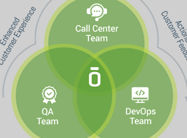
Customer Call Center
Integration2
Our expert team is ready to help you create or enhance your call center function, fully integrating customer feedback into the DevOps and QA process. As a result, we can consistently deliver a heightened customer experience and a more proactive product development roadmap that responds to market needs and drives business growth.
Improve customer experience and drive business growth with a unified approach
read the envoc blog >
Customer Call Center
Integration3
Our expert team is ready to help you create or enhance your call center function, fully integrating customer feedback into the DevOps and QA process. As a result, we can consistently deliver a heightened customer experience and a more proactive product development roadmap that responds to market needs and drives business growth.
Improve customer experience and drive business growth with a unified approach
read the envoc blog >

Technology Modernization
Future-proof your business
Software modernization is a critical process that enables businesses to stay competitive in today's ever-evolving digital landscape.
OUR PROCESS
ASSESSMENT AND PLANNING
Understand your current technology landscape and identify opportunities for modernization. Develop a comprehensive roadmap to guide the transformation journey.
IMPLEMENTATION AND INTEGRATION
Execute the modernization plan by introducing new technologies and systems while ensuring seamless integration with existing infrastructure. Prioritize minimal disruption and optimal efficiency during the transition.
OPTIMIZATION AND SUPPORT
Continuously refine and enhance your modernized technology stack, focusing on performance, security, and user experience. Rely on our expert support to maintain and optimize your investments for long-term success.

Modernizing your Software Landscape
READ THE GUIDE >“By adopting the recommendations outlined in this guide, organizations can harness the potential of modern software systems to drive innovation, enhance operational efficiency, and fuel growth.”

Product Strategy
Consultation
We work to develop a clear roadmap for success by aligning your product vision with market needs and customer expectations. Leveraging our expertise in strategic development, we collaborate with you to refine your product vision, enhance user experience, and unlock new growth opportunities.
Take a LEAP
Our initial LEAP process works to identify your product's strengths, opportunities, and market position.
Go slow to go fast
Our experts take deliberate steps at the project outset so we can move swiftly towards key milestones.