Every designer knows that clever, conceptual work doesn’t just happen. That simple abstract logo doesn’t just come to us, neither does that crazy, detailed illustration. We get there through trial and error. We look for inspiration wherever we can get it, and try out all of our ideas, with different techniques. If one mockup doesn’t work, we move on to the next.
That’s why I’m a strong believer in doodling. Putting pen to paper and simply making strokes can get the creative juices flowing. It will eventually help the ideas to flow, too. That’s how I like to start all of my designs. If I don’t have an initial idea, I start scribbling and something will usually pop up. If that doesn’t work, I then turn to other sources of inspiration, like Pinterest or going for a walk. If even that doesn’t work, then I have to try something new.
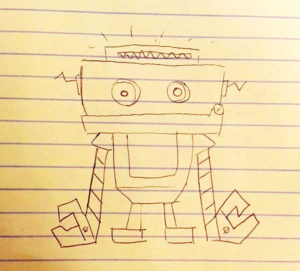
This is the process I followed when I designed my first logo for one of our clients. I had an initial idea in mind, but it just wasn’t working. I was drawing a creative blank. Literally. Instead of getting frustrated with myself, I decided to stop thinking about the logo, and I started doodling again. I drew whatever came into my mind, and I had fun with it. This is where Mike Envocski came in.
Mike Envocski
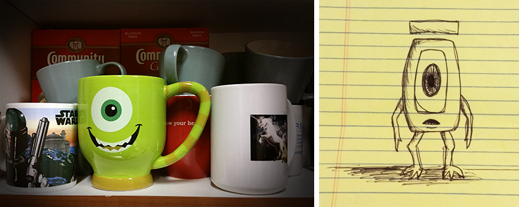
When I’m doodling, I tend to think about what I’ve seen lately to help me just start drawing. In this case, I was thinking about office surroundings. That morning, when I was pouring myself some coffee, I noticed how awesome our mug collection was. My favorite was a Monsters Inc. mug shaped like the character Mike Wazowski. I was also thinking about how unique the Envoc name was. The macron “ō” had an interesting shape to me. With these two things in mind, I made a quick doodle of Mike Envocski.
How did this help with the billable work I was stuck on?
Because of my creative block, I had to lessen my frustration. I needed to just make something cool and be more comfortable trying out new ideas. After I drew Mike, I was more creatively free to try new concepts, and I was able to deliver better logo mockups to a happy client. Plus, I had some doodles that were funny, and that never hurts.
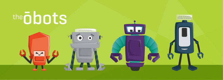
The First Obot
When I showed the Envoceans Mike Envocski, they thought it was funny, too. They wanted it to become the Envoc mascot. I thought that was an awesome idea, but we knew we couldn’t have a mascot similar to a Pixar character. Someone suggested that we make robot mascots instead, since we live the tech life. That’s when the very first Obot was created.
Designing the Obot Family
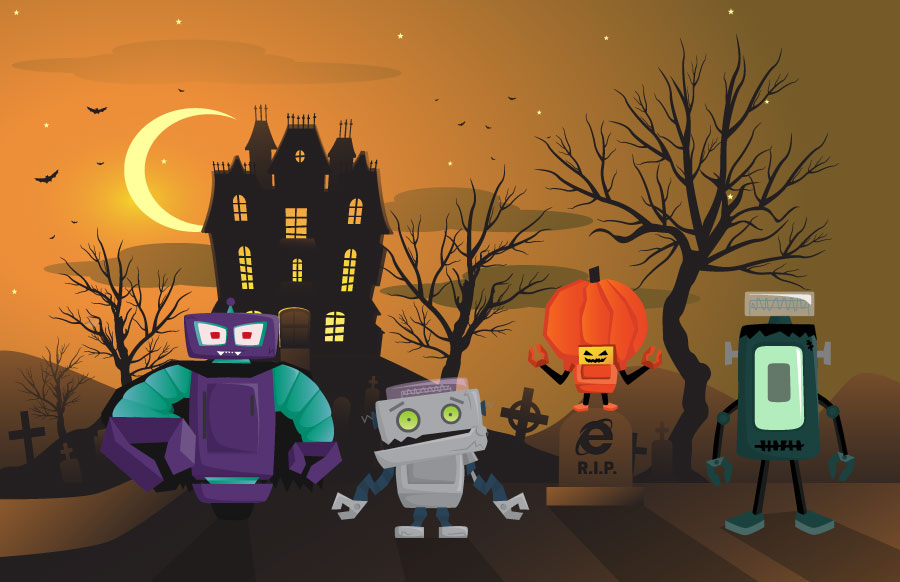
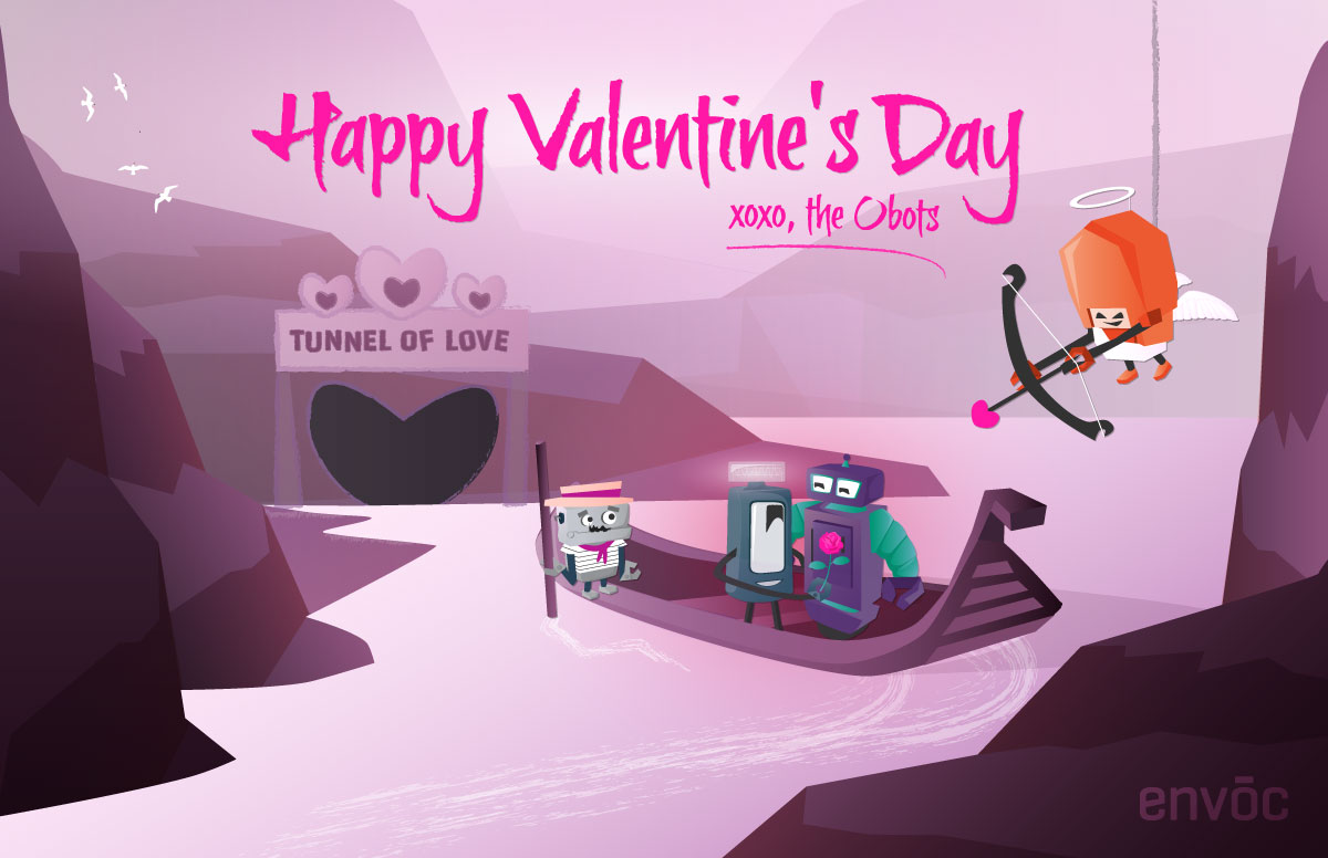
Working collaboratively, we decided that this little guy needed some friends, and started sketching more robots in all shapes and sizes. While we were sketching, we were coming up with ideas for how we could use these robots. We didn’t want to create something cool without sharing it. After consideration, we thought it would be fun to use them during the holidays and make illustrations to post on social media for everyone to enjoy.
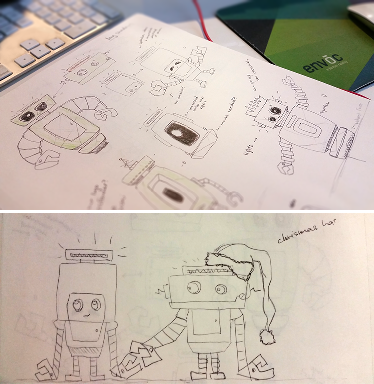
When we had a good idea of what we wanted the obots to look like, I began creating their skeletons in Adobe Illustrator. I wanted to make sure each of their shapes were interesting and unique, so I tried different things out for each one. After I had their shapes down, I started bringing them to life with the Envoc brand colors.
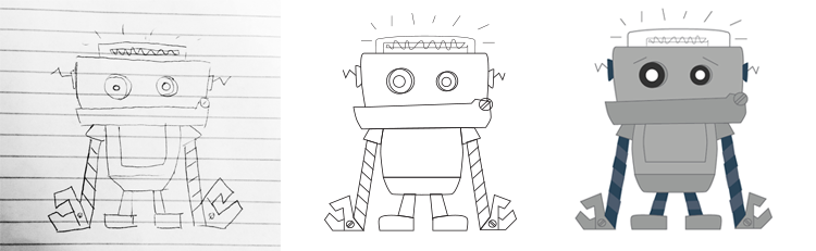
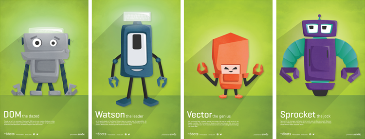
When I drew the first robot, I made him a little more dopey. Because they are usually smart, it was fun to imagine a not-so-bright, knuckle-dragging caveman of robots. I followed through with this personality when deciding on his color.
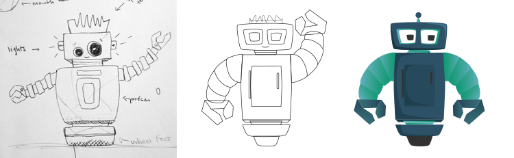
When I think of robots, I usually think of The Jetsons. I loved that show growing up. It influenced the second Obot’s design and personality. Because I had the dopey obot already, I wanted to contrast that by creating an obot that was smarter, more evolved, and a bit feminine. This Obot’s color changed to purple later on because we wanted to use all of Envoc’s brand colors and give it more femininity.
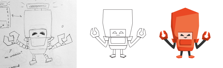
The third robot was an exploration more into the “dark side” of the Obots. Since the first two robots had nice demeanors, we had to add some conflict. No family is perfect, right? When designing this one, I was influenced by some of the big-headed villains I’ve seen in comic books. The idea of a tiny villain is just hilarious, and it’s fun to use in illustrations.
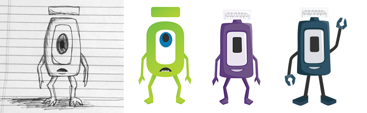
The last Obot that was designed was the hardest one. We knew we wanted one of them to look like the macron “ō” within the Envoc name. So, I worked off what I already had for Mike Envocski, and I started turning him into a fun-loving robot. This one became the leader of the bunch.
Naming the Obots
Once we finished developing the Obots and their personalities, we printed some swag stickers, and we had some fun creating holiday illustrations, like the 2014 Christmas microsite. Our social media fans were enjoying it, too. At this point, we didn’t have any names for them yet. It was hard for us to decide amongst ourselves, so we chose to let social media decide. We picked 5 names for each Obot, and we created short animations to show their different personalities. People could then vote on their favorite name for each Obot through Facebook or Twitter. To give them some incentive, we gave away swag stickers to those who voted the most. Finally, they had their names: DOM, Watson, Vector, and Sprocket.
We still use the Obots to market Envoc in a fun and lighthearted way, and their personalities continue to develop through the holiday illustrations. From what we’ve done so far:
- Vector is usually up to something.
- Watson is always having some fun.
- Sprocket is usually helping everyone out in some way.
- DOM is always a little clueless.
Keep an eye out in our next illustrations, and you’ll notice these things playing out.
What I Learned
Looking back now, I learned an important lesson when designing the Obots. You can’t be a designer with a fear of the new. If I didn’t decide to take a step back and try something different with that logo design, I wouldn’t have created something better, I wouldn’t have those silly doodles that turned into the Obots, and we wouldn’t have won an Addy for them.
My advice to any designer with a massive creative block like the one I had is this: just make stuff. Keep trying new sources of inspiration. It may not work out the first time, and it may be outside your comfort zone. No worries. It’s worth it. You never know what you might end up with.