
Envoc Branding: A History
Trust us, Envoc didn’t always look this good. In fact, the new Envoc brand evolved over several years before landing on what it is today. It was a slow (and sometimes painful) process, but it was worth it. We finally have a brand that speaks to our diverse expertise and brings us into the modern tech and design world. As a huge bonus, we’re finally proud to show it off on our new website without having to disclaimer it with “just wait, we’re building a better one.” In this blog post, we are going to take you behind the scenes to see the good, the bad, and the in-between stages of building our better brand.
Envoc: an Idea
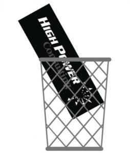
Let’s go back. Way back. Back to when Envoc was just a thought in our CEO, Calvin’s mind. He had established High Power Consulting as a software consulting company — which had its success.. But Calvin wanted more than just to consult—he wanted a true partnership with clients that would allow for collaboration as well as education. The word “invoke” is defined as “to call on for support or inspiration,” which is exactly what we wanted our clients to be encouraged to do. And thus, with a little twist to the spelling of the word, Envoc came to be.
Envoc 1.0
We were primarily a development/tech/software shop in the beginning, and the first Envoc logo gave us a great starting point. The colors and sans-serif type spoke to the tech industry at the time, and the tagline “a better reality” gave our brand its purpose for us internally and more importantly, for our clients. This first iteration established us as a company, but was not fully refined—yet.
![]()
Envoc 2.0
Fast forward three years and Calvin had yet another brilliant idea. What if we could take the power of software development and pair it with beautiful interfacing? Enter the Marriage of Maxon Media, a creative design firm, to Envoc. With the addition of designers into the mix, the first Envoc logo needed to be revisited. With a fine-toothed typographic comb, the next iteration was a tightened-up version of the original. The kerning (an industry term for the spacing between letters) was adjusted, and the proportion of the logotype to tagline was altered as well. It was more of what we like to call in the industry, a “logo refresh,” and not a full redesign.
Other than the logo and a few letterhead templates, there still was very little branding that had been established. A logo is not a brand. Who the company IS, is its brand. This new chapter in Envoc’s history was still new, and we were still learning who Envoc was (we’ll just call this the teen years). The Envoc brand needed more thought and care than it had ever had before.
![]()
Concept Time, Back to the Drawing Board
After the creative Envoceans were nice and settled into the groove of the development environment, they went to work on concepting. Hard. There were several ideas that were tossed around, and even “a civil war” over the macron (the line over the “o” in the logo) broke out briefly. It was a rough time. None of the concepts seemed to fit Envoc just right.
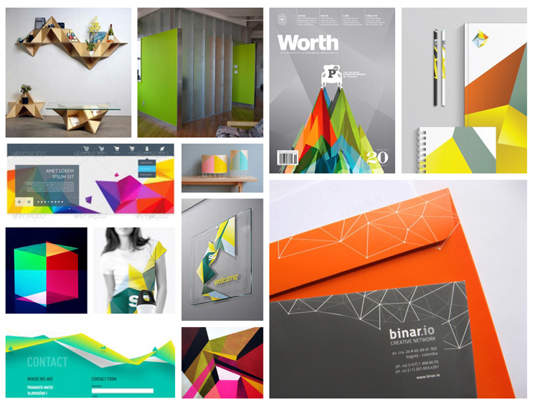
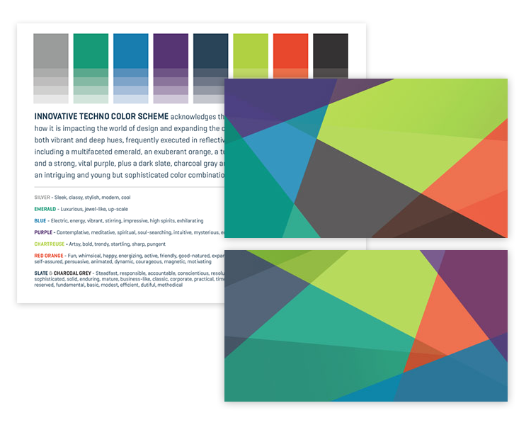
Finally, the ideas started to come together for there to be a representation of not what we do, but who we are. We realized that what sets us apart is the wide variety of skillsets under one roof, all coming together to make beautiful and functional products. The concept of “the prism” stuck. Multi-faceted and visually dynamic, the prism scheme represented our team perfectly. We went to work hunting down reference images that would serve as an inspiration to the budding brand.
Building the Brand
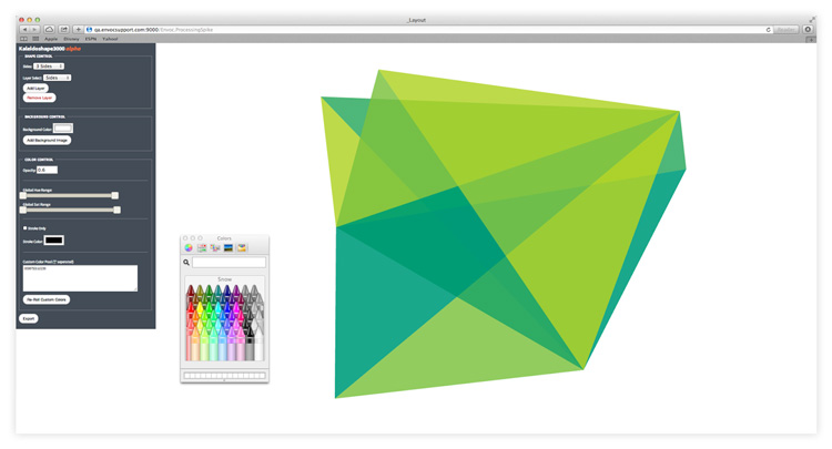
We then started drawing with pencil and paper shapes that could be used with this idea. And they were terrible. So, we called on our resident genius, Matt Vid, to help us build an interactive tool we could use to make the shapes we were longing for to make our branding dreams a better reality (how very Envoc of us…).
Bringing it All Together
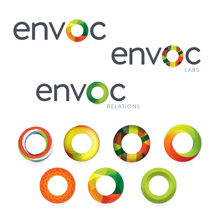
With a way to execute our “prisms” perfectly, we were finally on the road to something big. Next was color. We developed a broad color palette, with our green and blue being primary and adding in several complementary colors that would represent our diverse abilities. Once these colors were applied to the prisms, the result was a thing of beauty.
With a beautiful backdrop in place, we were ready to finalize the new logo. We kept the blue and green from the original Envoc logo and pumped up the saturation so the colors would pop. We updated our logotype font to the much-more modern and web-friendly “Geogrotesque,” perfected the typographic nuances, and voila. We had the new face of the company.
![]()
We Have Standards, People!
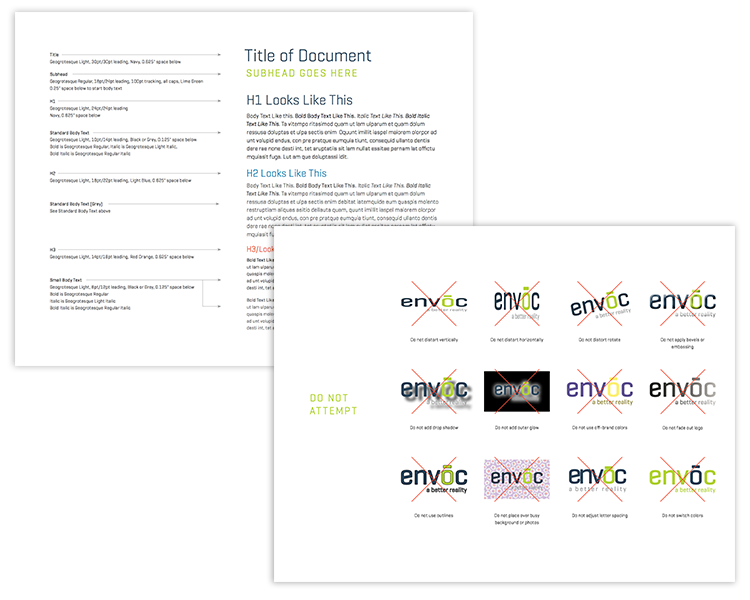
Finally, we had some pieces to work with. As with any of our branding projects for clients require, we made our own brand book that outlined specifics for using the various pieces. We have standardized the typography, logo usage (including what NOT to do), color usage, and how to use other elements that are brand-appropriate, like icons and patterns. The brand book ensures that the elements are always used properly, consistently, and appropriately. We want to make sure we have the same message going out in any of our branded material.
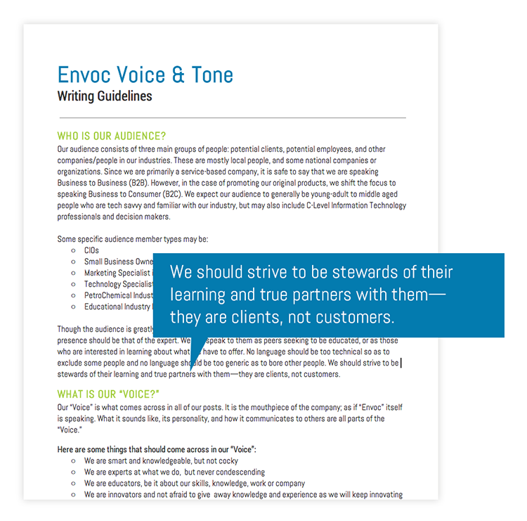
Like we mentioned earlier, a company’s brand is so much more than just the visuals. It is behind everything a company is, does, and even says. That’s why we wrote out a document defining Envoc’s Voice and Tone as well. Think of it as a standards manual for any writing that is sent out through Envoc, be it blog posts, emails, newsletters, social media posts, and the like. It is so important that a company has a consistent “voice” that can become as easily identifiable as their logo. The “voice” is the “person” that Envoc is.
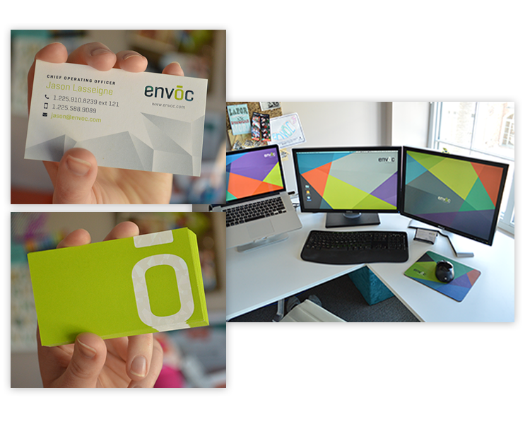
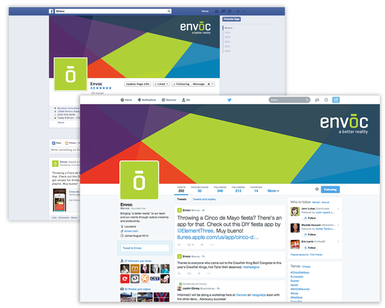
Apply that Brand All Over
Now that we had our visuals and persona standardized, we were ready to rock and roll. Business cards, mousepads, desktop backgrounds, social media pages… everything we could get our hands on we re-designed using the new brand as a driving force.
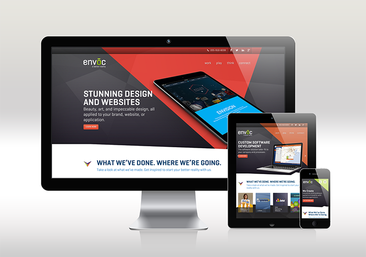
Website FTW
After all of this, we were ready to take on the biggest internal project of them all: the company website. The new envoc.com is the crowning jewel of our new brand (and, as you can tell, our pride and joy) and we are mighty proud of it. Another long and enduring process, but one that was more than worth it. After we launched it in early April, we finally felt that the new Envoc had matured and was ready for the all to see.
Fin.
For some reason, it’s almost more difficult to design for your own company than for a client’s. Maybe it’s because you have complete control and feel such a personal connection to it that you won’t stop until everything is perfect. We definitely had our struggles and put in tons (hundreds?) of hours, but having a brand that fits exactly who we are makes us proud to be a part of it.
We hope that you have enjoyed reading about how our brand came to be what it is today. If your brand needs some love (or needs to exist), we would love to talk to you about it. Invest in your brand. Spend the time. It is so important.